Web Development
Lesson 2: Layouts
1. HTML5 - What's New
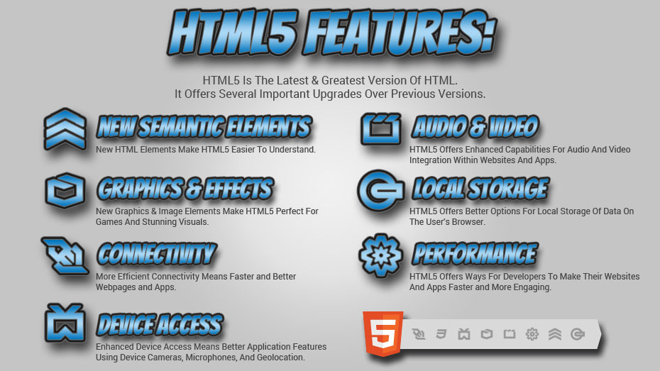
HTML, the language that drives the web, has evolved over the years. The current version of HTML is called HTML5, which gives us some exciting new elements and features.
New Semantic Elements:
HTML5 introduced new elements that make document structure easier to understand:
<header> <main> <article> <section>
<footer>
New Attributes For <form> Elements:
number date time range
New Graphic Elements:
<canvas> <svg>
New Multimedia Elements:
<audio> <video>
HTML5 also offers:
HTML Geolocation to produce maps.
HTML Drag and Drop to drag and drop elements.
HTML Local Storage to store small amounts of data on the user's browser.
To learn more about the elements and features HTML5 has to offer, check out the HTML5 CheatSheet
2. Add A Header And Top Navigation
Now that we know about some of the new elements included in HTML5, let's add a
<header> tag to our website (not to be confused with the <head>
tag) with a <nav> element inside of it. Below is our updated
index.html file.
(Be sure to update your <base> tag on line 12 to the name of your root folder).
ACTION STEP 1: Update your index.html file with the code below:
index.html
<!DOCTYPE html>
<html>
<head>
<meta charset="UTF-8">
<meta name="description" content="This is my personal website"/>
<meta name="keywords"
content="free web development tutorial, learn to build websites, learn
to build games, html, css, javascript, html5 canvas, html5 tutorial, html5 tutorial"/>
<meta name="robots" content="index, follow"/>
<!--This is where we'll link to our JavaScript file -->
<!--<script src="assets/js/main.js"> </script>-->
<base href="../MyWebsite/"/>
<link rel="stylesheet" type="text/css" href="assets/css/main.css">
<title>My Personal Website</title>
</head>
<body>
<header>
<div class="container header-container">
<div id="logo-header">
<a class="logo" href="#">
LOGO
</a>
</div>
<nav class="desktop-menu">
<ul id="topnav">
<li>
<a href="#" class="navtext">Page 1</a>
</li>
<li>
<a href="#" class="navtext">Page 2</a>
</li>
<li>
<a href="#" class="navtext">Page 3</a>
</li>
</ul>
</nav>
</div>
</header>
<div class="container wrapper">
<h1>This is an <h1> heading</h1>
<h2>This is an <h2> heading</h2>
<h3>This is an <h3> heading</h3>
<h4>This is an <h4> heading</h4>
<p>This is paragraph text inside a <p> tag</p>
<!-- We use this syntax to write comments -->
<ul>
<li>Unordered List Item #1</li>
<li>Unordered List Item #2</li>
<li>Unordered List Item #3</li>
</ul>
<ol>
<li>Ordered List Item #1</li>
<li>Ordered List Item #2</li>
<li>Ordered List Item #3</li>
</ol>
</div>
</body>
</html>
index.html file with header navigation added.
In the file above, we added several elements. Let's style these elements by adding to our main.css
file. Here is the updated main.css file:
ACTION STEP 2: Update your main.css file with the code below:
main.css
                              body {
                                font-family: 'Open Sans', sans-serif;
                                font-size: .875em;
                                color: #000000;
                                margin: 0;
                              }

                              header {
                                display: block;
                                width: 100%;
                              }

                              .container {
                                margin: 0 auto;
                                padding: 0 15px;
                                width: 970px;
                                overflow: hidden;
                              }

                              .header-container {
                                padding-top:10px;
                              }

                              #logo-header {
                                float:left;
                                display:inline-block;
                              }

                              nav.desktop-menu {
                                float: right;
                                display:inline-block;
                              }

                              ul#topnav {
                                margin: 0;
                                padding:0;
                              }

                              ul#topnav li {
                                display: inline-block;
                              }

                              ul#topnav li a {
                                text-decoration: none;
                                text-transform: uppercase;
                                padding: 0px 15px;
                              }

                              .wrapper {
                                padding: 30px;
                              }
main.css file with styles for our header navigation.
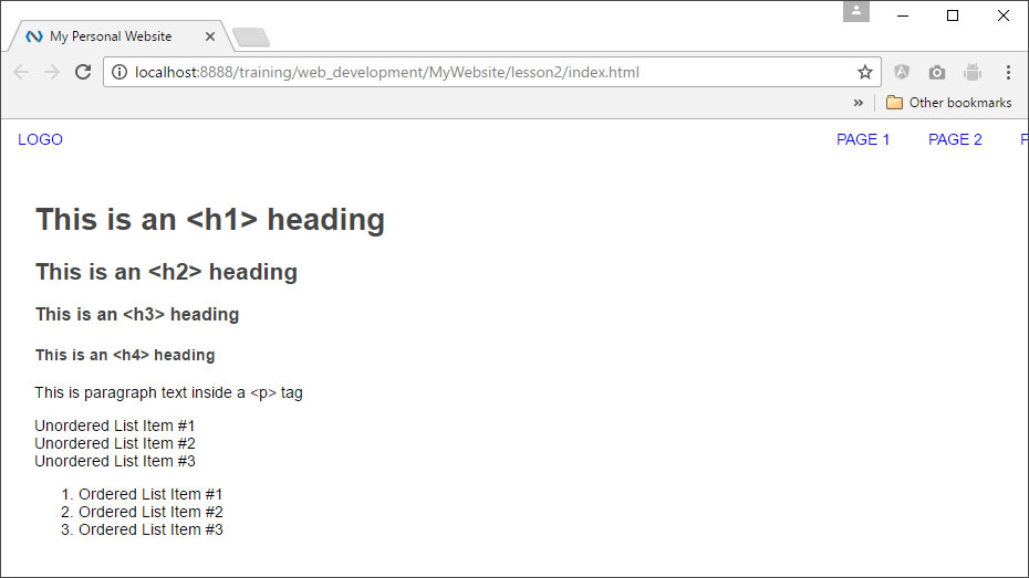
Now, our website has a space for a logo in the upper-left, and a navigation list in the upper-right:
Use Chrome
DevTools to examine the code structure and the new CSS. Click Here to see our
new index.html page in a browser.
3. Layout With CSS
In the code above, we laid out our page structure with CSS. Many of the HTML elements used to
structure web pages, like <div>, <header>,
<footer>, <section>, <main>, <article>,
and <nav> have a default CSS display: value of block. CSS displays block-level elements one on top of
another and stretches them out as much as it can depending upon the size of their parent element, like
this:
DISPLAY: BLOCK;
<div>
                              div {
                                display:block;
                              }
</div>
<div>
                              div {
                                display:block;
                              }
</div>
In our new layout, we used the display: value of
inline-block to align elements next to each other,
instead of on top of each other.
DISPLAY: INLINE-BLOCK;
<div>
                              div {
                                display:inline-block;
                              }
</div>
<div>
                              div {
                                display:inline-block;
                              }
</div>
We also used the float: property to push our
navigation to the right of its parent. The float:
property, however, removes elements from the flow of the page relative to block elements. This is why
we see the parent element of the floated elements collapse below:
FLOAT: LEFT; & FLOAT: RIGHT;
<div>
                              div {
                                display:inline-block;
                                float:left;
                              }
</div>
<div>
                              div {
                                display:inline-block;
                                float:right;
                              }
</div>
The float: property was
originally designed to allow the wrapping of text around a block element (like an image). Notice what
happens below when we include a block level <p> element inside the parent element
and float our <div> to the right. The parent element expands to fit the <p>
content.
<div>
                              div {
                                float:right;
                              }
</div>
<p>Lorem ipsum dolor sit amet, consectetur adipiscing elit. Phasellus imperdiet,
nulla et dictum interdum, nisi lorem egestas odio, vitae scelerisque enim ligula venenatis dolor.
Maecenas nisl est, ultrices nec congue eget, auctor vitae massa. Fusce luctus vestibulum augue ut
aliquet. Mauris ante ligula, facilisis sed ornare eu, lobortis in odio. Praesent convallis urna a
lacus interdum ut hendrerit risus congue. Nunc sagittis dictum nisi, sed ullamcorper ipsum dignissim
ac. In at libero sed nunc venenatis imperdiet sed ornare turpis. Donec vitae dui eget tellus gravida
venenatis. Integer fringilla congue eros non fermentum. Sed dapibus pulvinar nibh tempor porta. Cras
ac leo purus. Mauris quis diam velit.</p>
But, if our parent element only contains floated elements (like our header) we
need to set the overflow: property on the parent
element to hidden (or auto).
OVERFLOW: HIDDEN;
<div>
                              div {
                                display:inline-block;
                                float:left;
                              }
</div>
                              .parent-element {
                                overflow:hidden;
                              }
<div>
                              div {
                                display:inline-block;
                                float:right;
                              }
</div>
Now the parent element will expand to contain our floated elements.
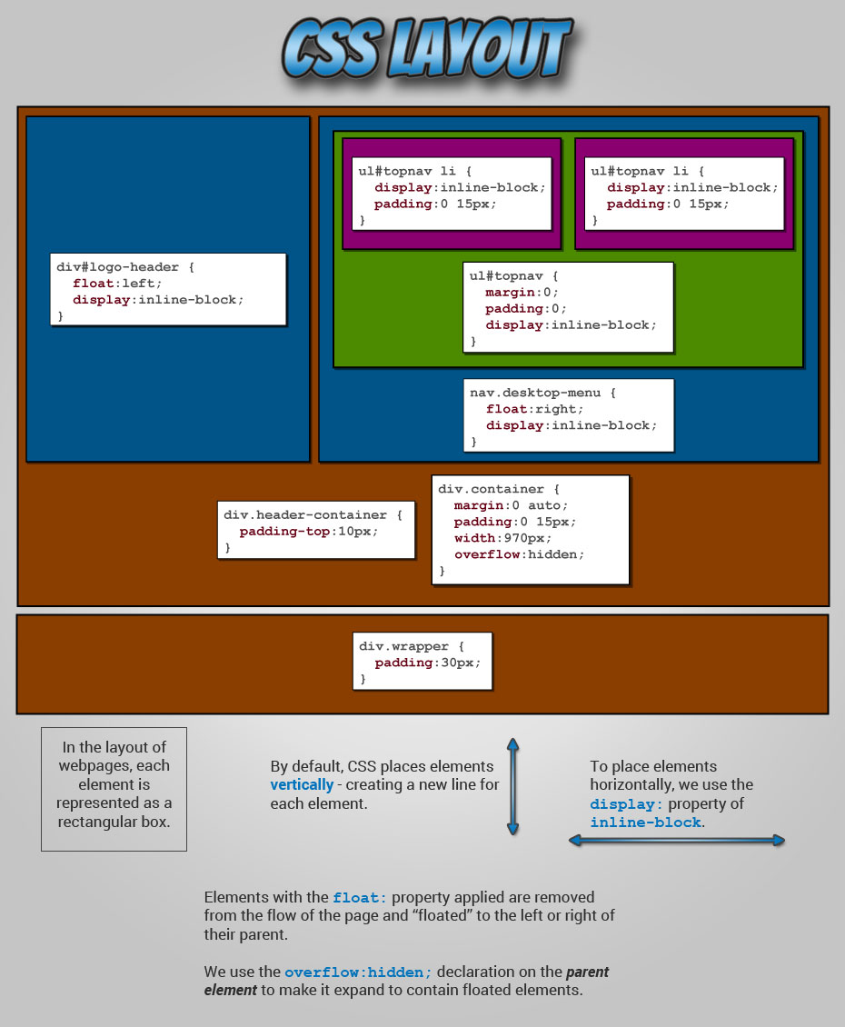
The image below illustrates the layout of our current website, and shows how we used CSS to position the various elements.
4. Add Sidebar and Sections
Using what we now know about page layout, let's add a sidebar to our page and break our content up into articles and sections (new lines are highlighted below).
ACTION STEP 3: Update your index.html file with the code below:
index.html
<!DOCTYPE html>
<html>
<head>
<meta charset="UTF-8">
<meta name="description" content="This is my personal website"/>
<meta name="keywords"
content="free web development tutorial, learn to build websites, learn
to build games, html, css, javascript, html5 canvas, html5 tutorial, html5 tutorial"/>
<meta name="robots" content="index, follow"/>
<!--This is where we'll link to our JavaScript file -->
<!--<script src="assets/js/main.js"> </script>-->
<base href="../MyWebsite/"/>
<link rel="stylesheet" type="text/css" href="assets/css/main.css">
<title>My Personal Website</title>
</head>
<body>
<header>
<div class="container header-container">
<div id="logo-header">
<a class="logo" href="#">
LOGO
</a>
</div>
<nav class="desktop-menu">
<ul id="topnav">
<li>
<a href="#" class="navtext">Page 1</a>
</li>
<li>
<a href="#" class="navtext">Page 2</a>
</li>
<li>
<a href="#" class="navtext">Page 3</a>
</li>
</ul>
</nav>
</div>
</header>
<div class="container wrapper">
<aside class="sidebar">
This is the sidebar
</aside>
<main class="page">
<article>
<header>
<h1>Article Heading (<h1>)</h1>
<h2>Article SubHeading (<h2>)</h2>
</header>
<section>
<h3>Section Heading (<h3>)</h3>
<p>This is paragraph text inside a <p> tag</p>
<h4>SubSection Heading (<h4>)</h4>
<ul>
<li>Unordered List Item #1</li>
<li>Unordered List Item #2</li>
<li>Unordered List Item #3</li>
</ul>
</section>
<section>
<h3>Section Heading (<h3>)</h3>
<p>This is paragraph text inside a <p> tag</p>
<h4>SubSection Heading (<h4>)</h4>
<ul>
<li>Unordered List Item #1</li>
<li>Unordered List Item #2</li>
<li>Unordered List Item #3</li>
</ul>
</section>
</article>
</main>
</div>
</body>
</html>
index.html file with a sidebar and HTML5 elements
added.
Our CSS file will also change to style the new elements (new declarations also highlighted):
ACTION STEP 4: Update your main.css file with the code below:
main.css
                              body {
                                font-family: 'Open Sans', sans-serif;
                                font-size: .875em;
                                color: #000000;
                                margin: 0;
                              }

                              a {
                                text-decoration: none;
                              }

                              header {
                                display: block;
                                width: 100%;
                              }

                              .container {
                                margin: 0 auto;
                                padding: 0 15px;
                                width: 970px;
                                overflow: hidden;
                              }

                              .header-container {
                                padding-top:10px;
                              }

                              #logo-header {
                                float:left;
                                display:inline-block;
                              }

                              nav.desktop-menu {
                                float: right;
                                display:inline-block;
                              }

                              ul#topnav {
                                margin: 0;
                                padding:0;
                              }

                              ul#topnav li {
                                display: inline-block;
                              }

                              ul#topnav li a {
                                text-transform: uppercase;
                                padding: 0px 15px;
                              }

                              .wrapper {
                                padding: 30px;
                              }

                              aside.sidebar {
                                width:25%;
                                float:left;
                              }

                              main.page {
                                width:75%;
                                float:left;
                              }

                              article h1 {
                                font-size:2em;
                              }
main.css file with styles for our sidebar and HTML5 elements.
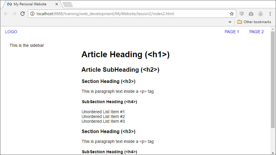
The image below shows what our new website looks like. You can Click Here to see the site in action.
5. Add Logo, Links, And Data
The basic structure of our page is set up, but the page doesn't really serve any purpose yet. Let's change that! We'll be using our page to create web flashcards to help us with our studies. We'll also add links to resources in our sidebar so we have everything we need on one page. Best of all, once the page is complete we'll be able to copy and reuse our code to help us study any subject. We'll also improve the look of our site by adding some color and a logo in the upper-left-hand corner.
First, below is the logo for the updated page. Right Click on it and select Save Image As...
ACTION STEP 5: Save this image in your MyWebsite/img directory OR create
your own.

If you create your own image, make sure that it measures 300 pixels wide by 75 pixels high.
And, here is the updated index.html file:
ACTION STEP 6: Update your index.html file with the code below:
index.html
<!DOCTYPE html>
<html lang="en">
<head>
<meta charset="UTF-8">
<meta name="description" content="This is my personal website"/>
<meta name="keywords"
content="free web development tutorial, learn to build websites, learn
to build games, html, css, javascript, html5 canvas, html5 tutorial, html5 tutorial"/>
<meta name="robots" content="index, follow"/>
<!--This is where we'll link to our JavaScript file -->
<!--<script src="assets/js/main.js"> </script>-->
<base href="../MyWebsite/"/>
<link rel="stylesheet" type="text/css" href="assets/css/main.css">
<title>My Personal Website</title>
</head>
<body>
<header>
<div class="container header-container">
<div id="logo-header">
<a class="logo" href="./index.html">
<img src="assets/img/myLogo.png" alt="Logo" width="300" height="75">
</a>
</div>
<nav class="desktop-menu">
<ul id="topnav">
<li>
<a href="#" class="navtext">Math</a>
</li>
<li>
<a href="#" class="navtext">Science</a>
</li>
<li>
<a href="#" class="navtext">Literature</a>
</li>
<li>
<a href="#" class="navtext">Social Studies</a>
</li>
</ul>
</nav>
</div>
</header>
<div class="container wrapper">
<aside class="sidebar">
<h4>Resources</h4>
<ul>
<li><a href="https://www.constituteproject.org/constitution/United_States_of_America_1992" target="_blank">The U.S. Constitution</a></li>
<li><a href="https://www.usa.gov/branches-of-government" target="_blank">Branches Of Government</a></li>
<li><a href="https://en.wikipedia.org/wiki/Federal_government_of_the_United_States" target="_blank">U.S. Federal Government Wiki</a></li>
<li><a href="http://uscode.house.gov/" target="_blank">The U.S. Code</a></li>
</ul>
</aside>
<main class="page">
<article>
<h1>My Web Flashcards</h1>
<h2>Branches Of The U.S. Government</h2>
<section id="section-1">
<div class="card">
<div class="front face">
<h3>Question 1:</h3>
<p class="card-text">What are the three branches of the U.S. Government?</p>
</div>
<div class="back face">
<h3>Answer 1:</h3>
<p class="card-text">The Legislative, Executive, and Judicial</p>
</div>
</div>
</section>
<section id="section-2">
<div class="card">
<div class="front face">
<h3>Question 2:</h3>
<p class="card-text">What is the role of the legislative branch?</p>
</div>
<div class="back face">
<h3>Answer 2:</h3>
<p class="card-text">The legislative branch enacts legislation, confirms or rejects presidential appointments, and has the authority to declare war.</p>
</div>
</div>
</section>
<section id="section-3">
<div class="card">
<div class="front face">
<h3>Question 3:</h3>
<p class="card-text">What are the two legislative bodies of Congress?</p>
</div>
<div class="back face">
<h3>Answer 3:</h3>
<p class="card-text">The House of Representatives and the Senate.</p>
</div>
</div>
</section>
<section id="section-4">
<div class="card">
<div class="front face">
<h3>Question 4:</h3>
<p class="card-text">How many U.S. Senators are in Congress, and how long is a Senate term?</p>
</div>
<div class="back face">
<h3>Answer 4:</h3>
<p class="card-text">There are 100 senators (two from each state) and a senate term is six years.</p>
</div>
</div>
</section>
<section id="section-5">
<div class="card">
<div class="front face">
<h3>Question 5:</h3>
<p class="card-text">How many members of the House of Representatives are in Congress, and how long is a house term?</p>
</div>
<div class="back face">
<h3>Answer 5:</h3>
<p class="card-text">There are 435 members of the House (at least one from each state) and a House term is two years.</p>
</div>
</div>
</section>
<section id="section-6">
<div class="card">
<div class="front face">
<h3>Question 6:</h3>
<p class="card-text">What determines the number of Representatives from each state?</p>
</div>
<div class="back face">
<h3>Answer 6:</h3>
<p class="card-text">Members of the House represent state districts, and the number of districts in each state is determined by a state's population.</p>
</div>
</div>
</section>
<section id="section-7">
<div class="card">
<div class="front face">
<h3>Question 7:</h3>
<p class="card-text">What is the role of the Executive Branch?</p>
</div>
<div class="back face">
<h3>Answer 7:</h3>
<p class="card-text">The Executive Branch carries out and enforces laws. It includes the President, Vice President, and The Cabinet.</p>
</div>
</div>
</section>
<section id="section-8">
<div class="card">
<div class="front face">
<h3>Question 8:</h3>
<p class="card-text">Which officeholder acts as the commander-in-chief of The United States Armed Forces?</p>
</div>
<div class="back face">
<h3>Answer 8:</h3>
<p class="card-text">The President Of The United States</p>
</div>
</div>
</section>
<section id="section-9">
<div class="card">
<div class="front face">
<h3>Question 9:</h3>
<p class="card-text">What governing body approves cabinet members and Supreme Court Justices? How many votes are required for approval?</p>
</div>
<div class="back face">
<h3>Answer 9:</h3>
<p class="card-text">The Senate with 51 votes.</p>
</div>
</div>
</section>
<section id="section-10">
<div class="card">
<div class="front face">
<h3>Question 10:</h3>
<p class="card-text">What is the role of the Judicial Branch?</p>
</div>
<div class="back face">
<h3>Answer 10:</h3>
<p class="card-text">The Judicial Branch interprets the meaning of laws, applies laws to individual cases, and decides if laws violate the Constitution.</p>
</div>
</div>
</section>
<section id="section-11">
<div class="card">
<div class="front face">
<h3>Question 11:</h3>
<p class="card-text">What is the term length of Supreme Court Justices?</p>
</div>
<div class="back face">
<h3>Answer 11:</h3>
<p class="card-text">There is no fixed term for justices. They serve until their death, retirement, or removal in exceptional circumstances.</p>
</div>
</div>
</section>
<section id="section-12">
<div class="card">
<div class="front face">
<h3>Question 12:</h3>
<p class="card-text">According to current U.S. law, how many justices are to serve on the Supreme Court?</p>
</div>
<div class="back face">
<h3>Answer 12:</h3>
<p class="card-text">Nine - one Chief Justice and eight associate justices.</p>
</div>
</div>
</section>
<section id="section-13">
<div class="card">
<div class="front face">
<h3>Question 13:</h3>
<p class="card-text">How many Supreme Court Justices are needed to decide a case, and what is this minimum called?</p>
</div>
<div class="back face">
<h3>Answer 13:</h3>
<p class="card-text">Six justices constitute a "quorum" — the minimum needed to decide a case. </p>
</div>
</div>
</section>
</article>
</main>
</div>
</body>
</html>
index.html file with real data, links, and a logo image.
ACTION STEP 7: Update your main.css file with the code below:
main.css
                                  body {
                                  font-family: 'Open Sans', sans-serif;
                                  font-size: .875em;
                                  color: #000000;
                                  margin: 0;
                                }

                                a {
                                  text-decoration: none;
                                }

                                ul {
                                  list-style-type: none;
                                  padding: 0;
                                }

                                header {
                                  display: block;
                                  width: 100%;
                                }

                                .container {
                                  margin: 0 auto;
                                  padding: 0 15px;
                                  width: 970px;
                                  overflow: hidden;
                                }

                                .header-container {
                                  padding-top:10px;
                                }

                                #logo-header {
                                  float:left;
                                  display:inline-block;
                                }

                                nav.desktop-menu {
                                  float: right;
                                  display:inline-block;
                                }

                                ul#topnav {
                                  margin: 0;
                                  padding:0;
                                }

                                ul#topnav li {
                                  display: inline-block;
                                }

                                ul#topnav li a {
                                  text-transform: uppercase;
                                  padding: 0px 15px;
                                }

                                .wrapper {
                                  padding: 30px;
                                }

                                aside.sidebar {
                                  width:25%;
                                  float:left;
                                }

                                main.page {
                                  width:75%;
                                  float:left;
                                }

                                article h1 {
                                  font-size:2em;
                                }

                                h1, h2, h3, h4 {
                                  color: #464646;
                                }

                                .front h3 {
                                  color: #FFF;
                                }

                                .card {
                                  width: 300px;
                                  height: 225px;
                                  border: 6px solid #FFF;
                                  border-radius: 6px;
                                  cursor: pointer;
                                  text-align: center;
                                  -webkit-transform-style: preserve-3d;
                                  -moz-transform-style: preserve-3d;
                                  -ms-transform-style: preserve-3d;
                                  transform-style: preserve-3d;
                                  -webkit-transition: all 1s linear 0s;
                                  -moz-transition: all 1s linear 0s;
                                  -o-transition: all 1s linear 0s;
                                  -ms-transition: all 1s linear 0s;
                                  transition: all 1s linear 0s;
                                  -webkit-box-shadow: 0px 0px 10px #aaa;
                                  box-shadow: 0px 0px 10px #aaa;
                                }

                                .card:hover {
                                  -webkit-transform: rotateY(180deg);
                                  -moz-transform: rotateY(180deg);
                                  -o-transform: rotateY(180deg);
                                  -ms-transform: rotateY(180deg);
                                  transform: rotateY(180deg);
                                }

                                .face {
                                  position: absolute;
                                  width: 100%;
                                  height: 100%;
                                  -webkit-backface-visibility: hidden;
                                  -moz-backface-visibility: hidden;
                                  -ms-backfface-visibility: hidden;
                                  backface-visibility: hidden;
                                }

                                .front{
                                  background: #512da8;
                                  color:#FFF;
                                  border-radius: 6px;
                                }

                                .back {
                                  background-color: #ffd800;
                                  color: #464646;
                                  border-radius: 6px;
                                  -webkit-transform: rotateY(180deg);
                                  -moz-transform: rotateY(180deg);
                                  -o-transform: rotateY(180deg);
                                  -ms-transform: rotateY(180deg);
                                  transform: rotateY(180deg);
                                }

                                section {
                                  padding:20px;
                                  float:left;
                                }

                                p.card-text {
                                  padding: 0 20px;
                                  font-weight: bold;
                                  font-size: 20px;
                                  text-transform: capitalize;
                                }
main.css file with styles for our logo, links, and data.
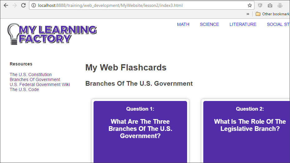
Our page now looks like this:
And you can Click
Here to see this new index.html page in a browser.
We've added our flashcards, and if we hover over them, we can see the answers. We've also added our logo image and links to resources we may need in the sidebar.
We've also added a lot of new CSS declarations as well. We'll take a deeper look at the CSS beginning with the next lesson.
